Designing a Centralized Vendor Coordination Platform for Logistics Operations
MeetPoint - A Case Study by Bijoy Paul
Overview
MeetPoint is a centralized vendor coordination platform designed for logistics operations. The platform streamlines scheduling, communication, follow-ups, and vendor interactions by bringing operational workflows into a single unified workspace.
Instead of relying on fragmented tools such as emails, spreadsheets, calendars, and standalone communication platforms, the solution provides centralized visibility into meetings, discussions, notes, and scheduling activities—improving workflow continuity, collaboration efficiency, and operational coordination across vendor networks.
Problem
The client faced operational inefficiencies caused by fragmented vendor coordination workflows spread across emails, phone calls, calendars, spreadsheets, and standalone communication tools. Managing schedules, tracking follow-ups, maintaining meeting visibility, and coordinating vendor interactions required constant switching between disconnected systems.
This fragmented process led to communication gaps, missed follow-ups, limited operational visibility, and increased administrative overhead. The core challenge was the absence of a centralized operational workspace that could unify scheduling, communication, meeting context, and workflow tracking into a seamless coordination experience.
Role
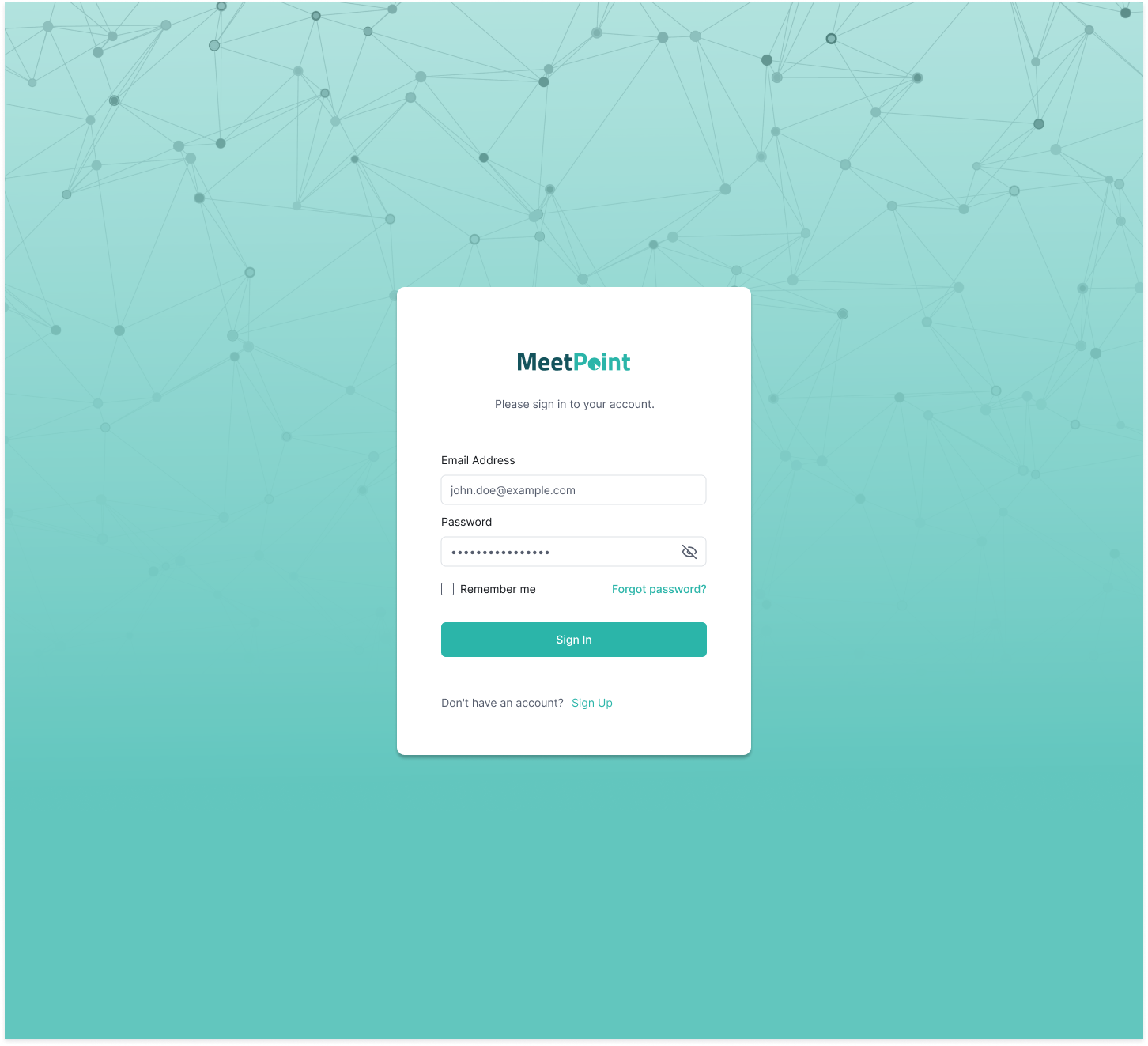
As the UI/UX designer, I was responsible for crafting an intuitive and visually cohesive user experience that aligns with the client’s brand identity and facilitates seamless interaction with core features including meeting calendars, messaging, notes, and scheduling.
Design Process
Research and Discovery
Collaborated closely with the client and key vendor stakeholders to conduct contextual inquiries, stakeholder interviews, and competitive analysis. Identified critical pain points such as inefficient meeting scheduling, fragmented communication channels, and lack of centralized meeting data. Synthesized findings into a detailed requirements document prioritizing features that would maximize organizational efficiency and vendor collaboration.
Information Architecture
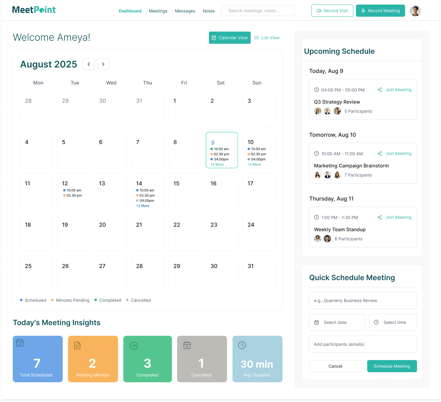
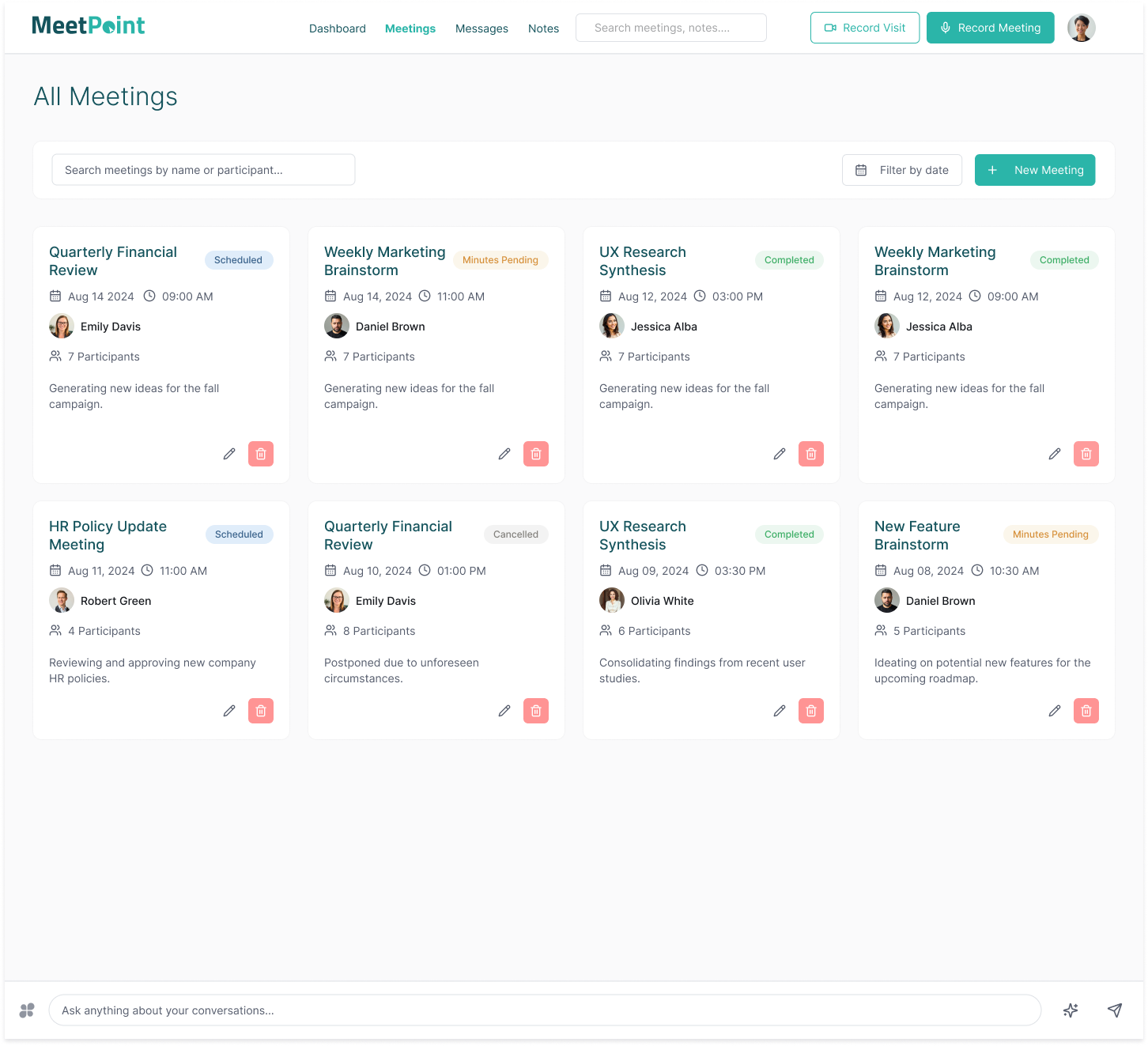
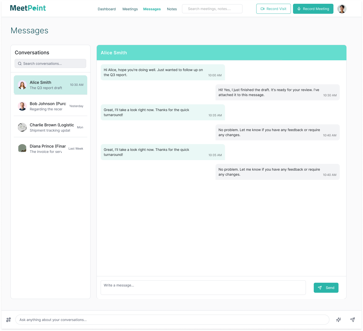
Developed a clear site map and user flow diagrams to establish logical navigation paths. Mapped out core features including Meeting Dashboard, Meeting List, Real-time Messaging, Collaborative Notes, and Quick Meeting Scheduling. Ensured intuitive grouping and minimal cognitive load, enabling users to complete key tasks with minimal friction.
Wireframing and Prototyping
Created low-fidelity wireframes emphasizing layout, hierarchy, and usability. Conducted iterative walkthroughs with client and vendor representatives to validate flows and surface hidden user needs. Developed interactive prototypes for key screens using industry-standard tools to gather early usability feedback, refining designs based on real-world use cases and accessibility considerations.
Visual Design
Applied a cohesive visual language reflecting the client’s brand identity—utilizing a balanced teal color palette to convey trust and professionalism. Carefully selected typography for readability and established consistent iconography and status indicators to facilitate rapid information scanning. Designed responsive layouts ensuring an optimal experience across desktop, tablet, and mobile devices.
Testing and Refinement
Deployed usability testing sessions including remote user tests and on-site observations with real vendors and client teams. Collected qualitative and quantitative data to identify usability bottlenecks and interface inconsistencies. Iteratively refined interaction patterns, visual hierarchy, and accessibility compliance to deliver a polished, intuitive product that meets diverse user needs.
Outcome
- The platform centralizes vendor scheduling and coordination with color-coded statuses that improve workflow visibility, clarity, and operational efficiency.
- Integrated messaging and note-taking features foster transparent communication and enhance collaboration between the client and vendors.
- The Quick Schedule functionality allows users to create meetings efficiently, streamlining the scheduling process.
- Responsive design ensures a seamless and consistent user experience across desktop, tablet, and mobile devices.
- Operational efficiency increases by reducing communication gaps and consolidating meeting management into a single hub.
- User feedback has been positive, emphasizing the intuitive interface and consolidated workflow as major strengths.