Designing a Smarter Way to Plan, Track, and Collaborate
ProjectChef - A Case Study by Bijoy Paul
Overview
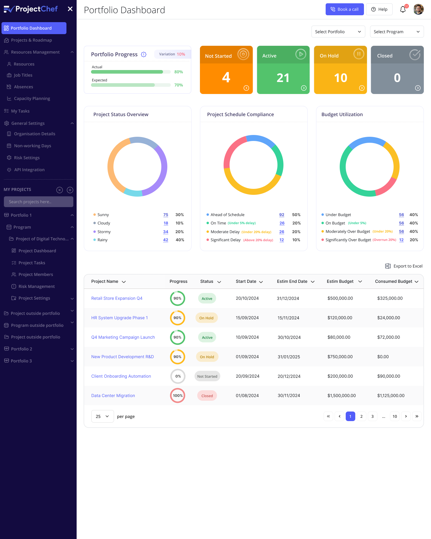
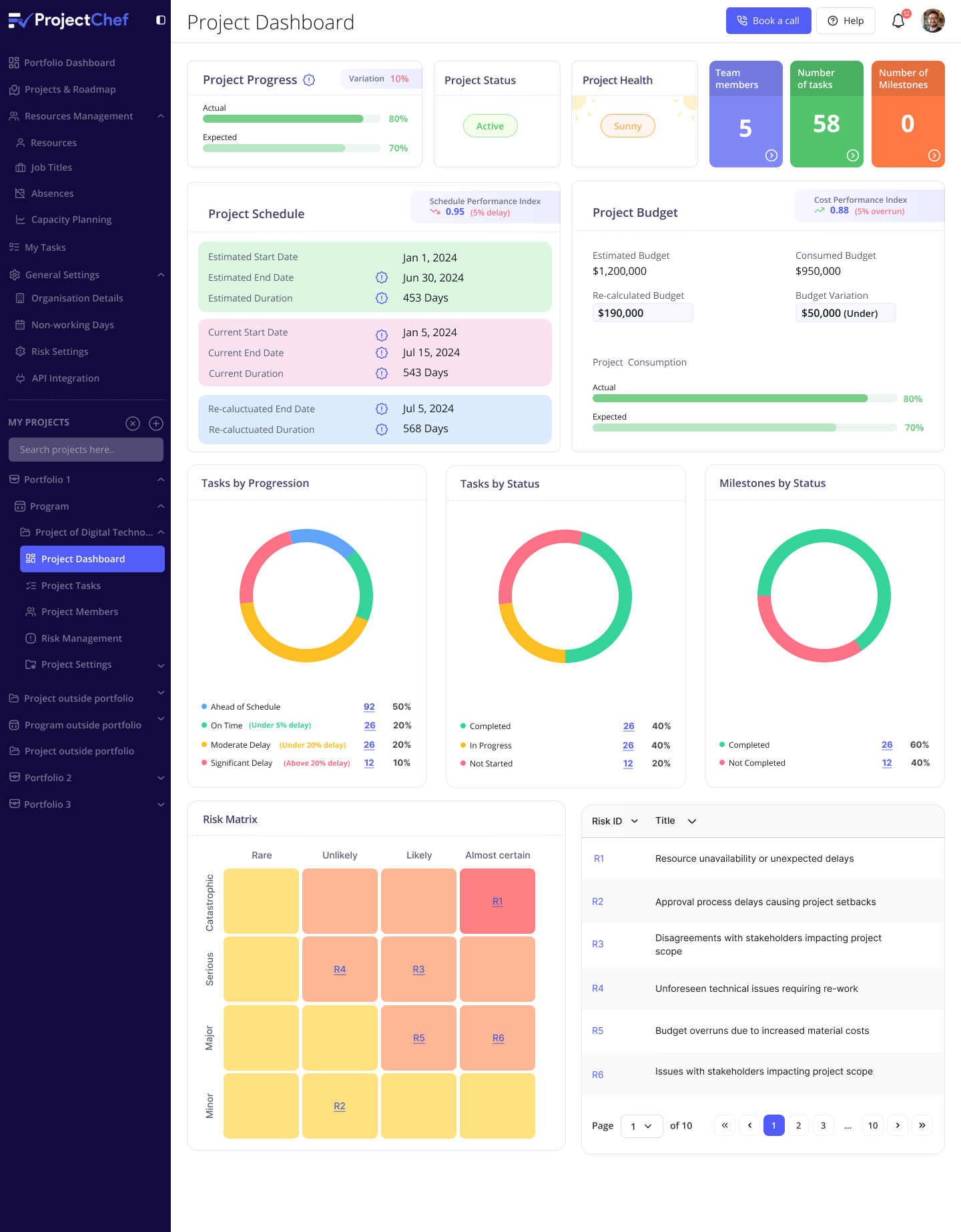
Project Chef is a project management platform designed to help teams collaborate efficiently, manage deadlines, and track progress through an intuitive and visually structured interface. The goal was to simplify complex workflows while maintaining a clean, modern, and engaging user experience.
Problem
Teams often find traditional project management tools too cluttered or overwhelming, leading to poor adoption and reduced productivity. The challenge was to create a lightweight, visually guided system that balances simplicity with functionality.
Role
As Lead UI/UX Designer for Project Chef, responsibilities included managing the end-to-end design process — defining user flows, creating wireframes, and delivering high-fidelity interfaces and interactive prototypes. The focus was on crafting a clean, intuitive interface that simplifies project management and enhances team collaboration. The role also involved building a consistent design system, maintaining visual harmony across screens, and ensuring the overall experience aligns with the product’s goal of improving productivity and efficiency.
Design Process
Research and Discovery
Conducted stakeholder interviews and competitor analysis to understand how teams manage projects and track progress. Identified common issues such as cluttered dashboards, confusing task hierarchies, and lack of visibility in progress tracking. Defined clear objectives to design a lightweight, focused, and visually organized project management solution.
Information Architecture
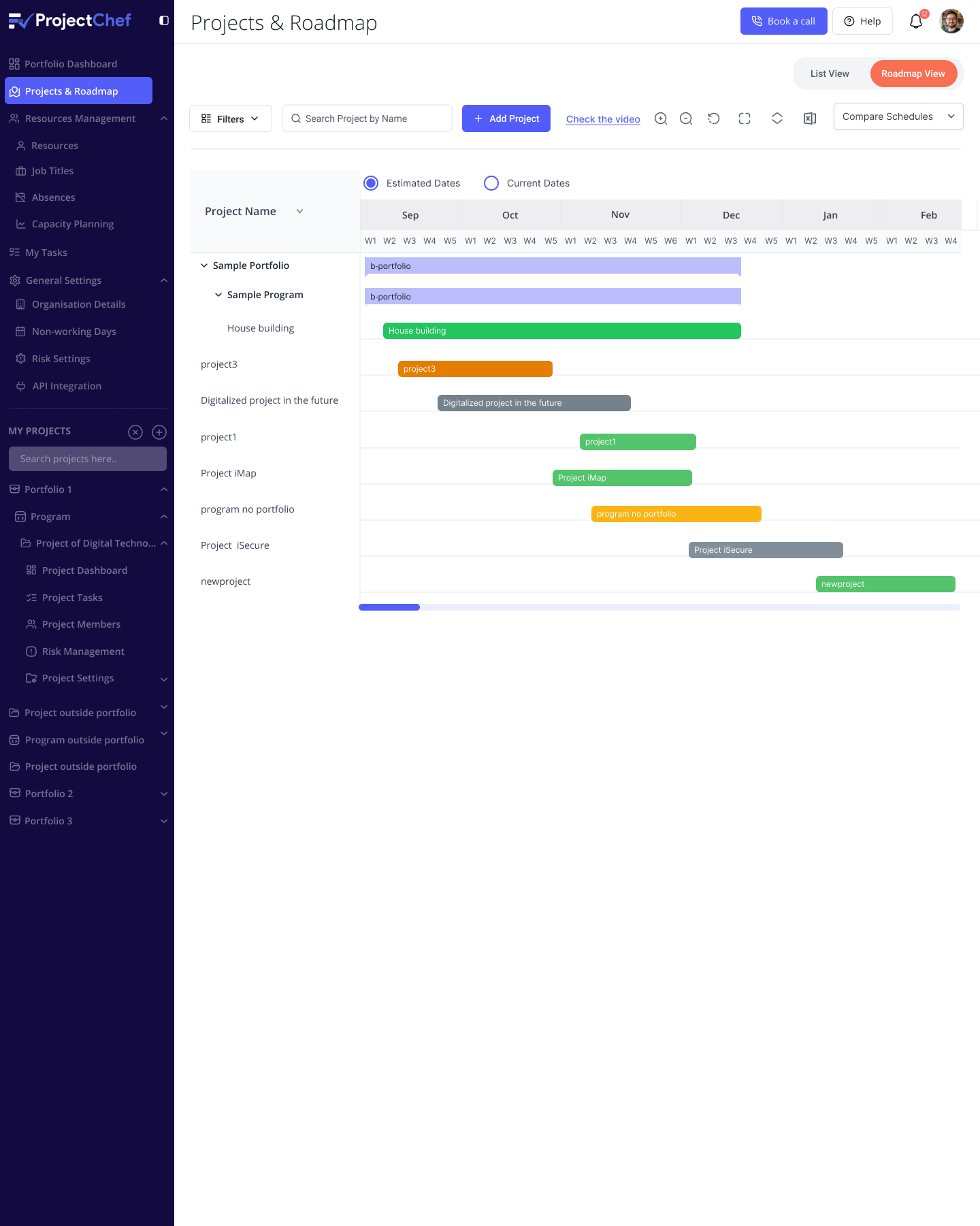
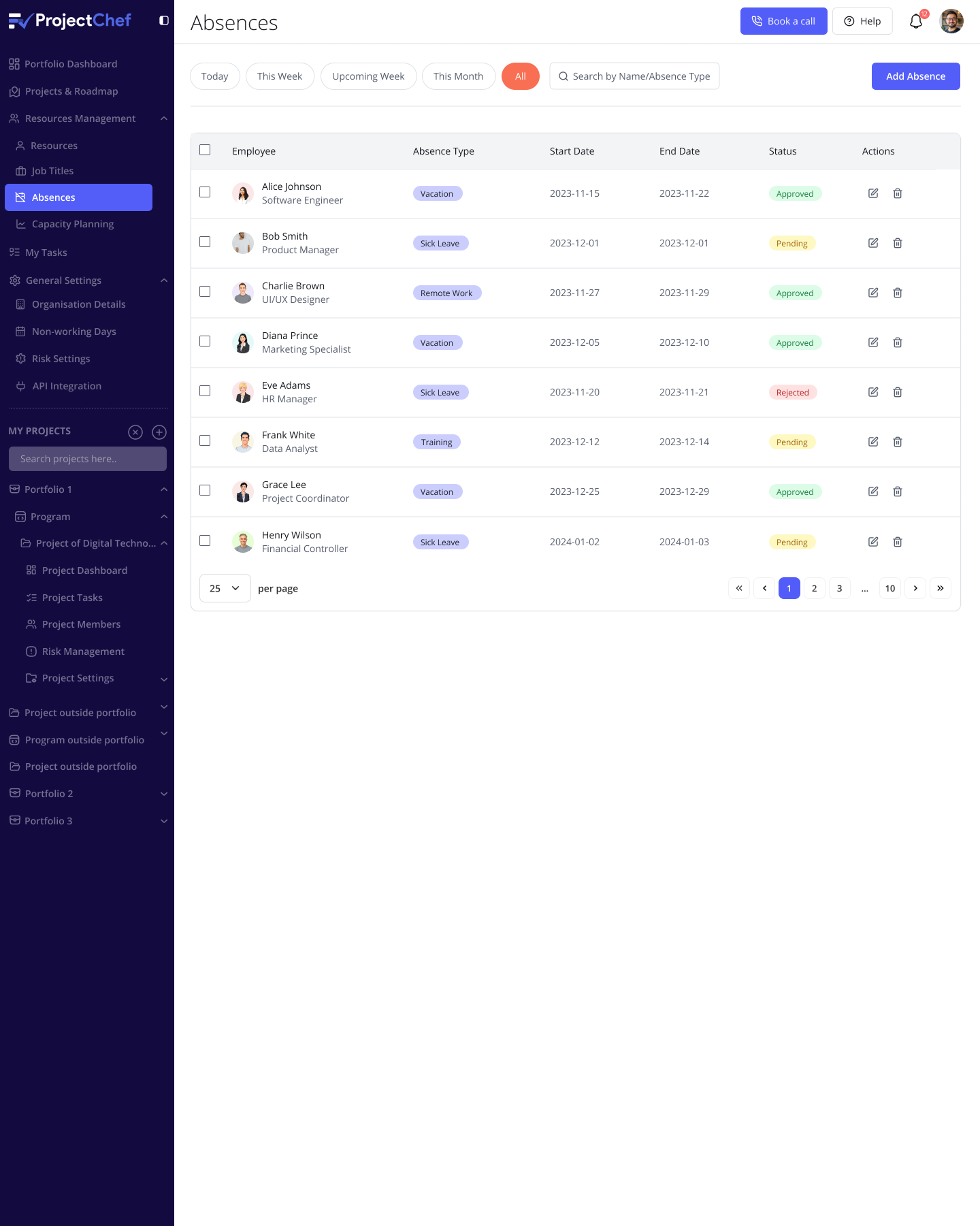
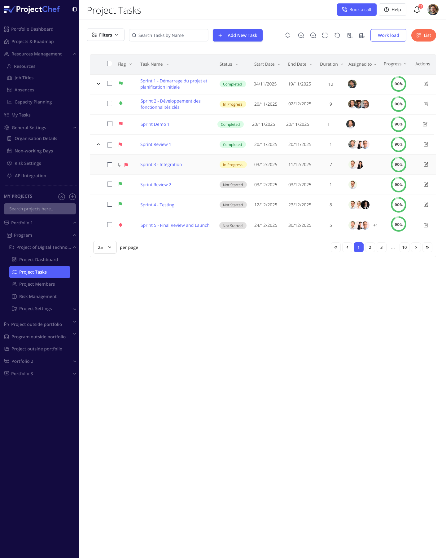
Structured the platform around essential workflows including Project Dashboard, Task Board, Team Collaboration, and Progress Reports. Designed logical navigation paths and grouped functions intuitively to reduce cognitive load. Focused on providing clarity and quick access to critical information without overwhelming users with excessive data.
Wireframing and Prototyping
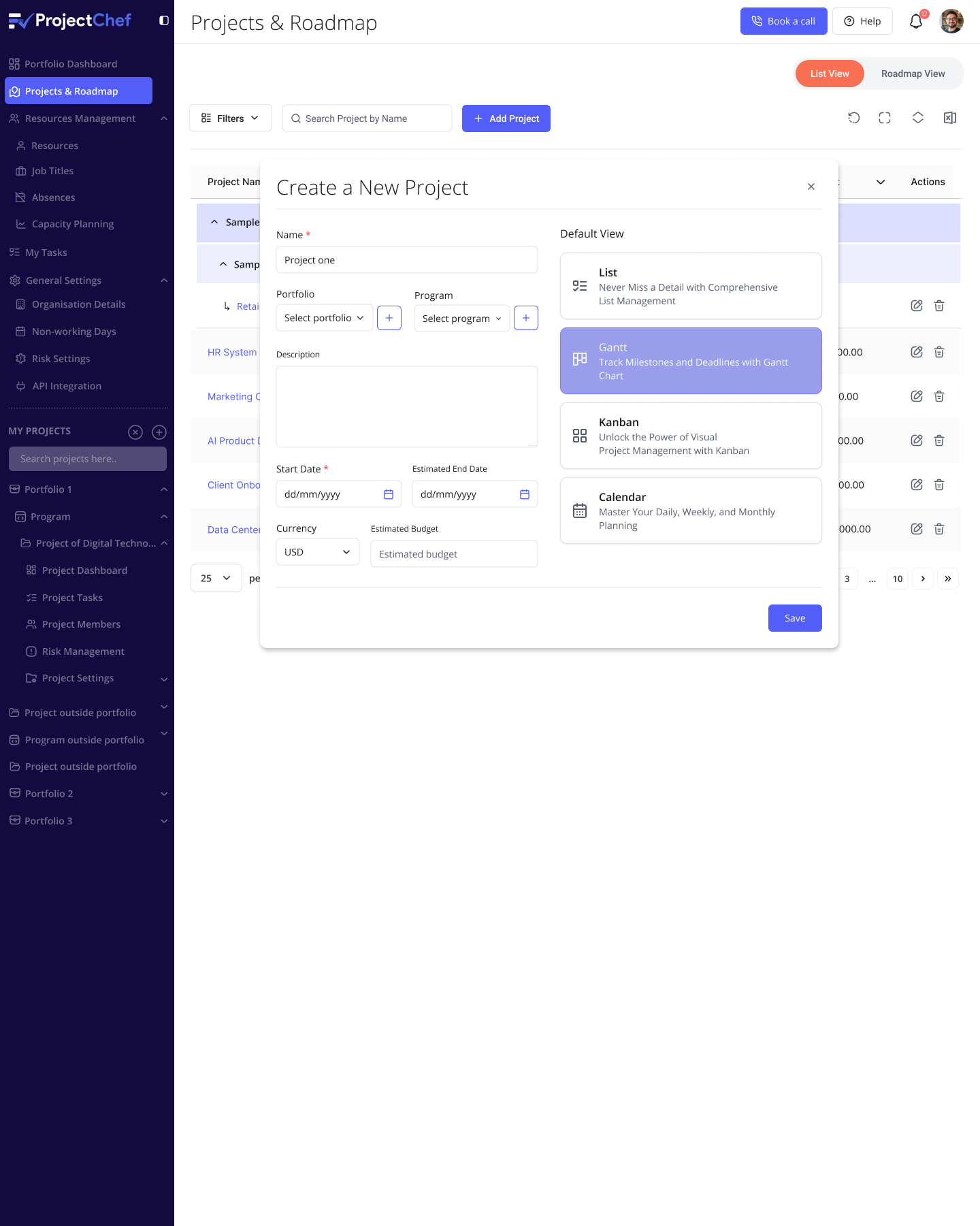
Developed low-fidelity wireframes to visualize page hierarchy, layout, and user flow. Iteratively refined screens based on internal feedback to ensure logical task organization and smooth transitions. Created interactive prototypes in Figma to test how users create, assign, and track tasks, ensuring usability before moving into final visuals.
Visual Design
Established a clean, modular design system using a calm blue palette that conveys focus and reliability. Selected geometric sans-serif typography for readability and incorporated consistent icons and progress indicators to communicate task states at a glance. Designed responsive interfaces optimized for both desktop and mobile views, maintaining visual clarity across all devices.
Testing and Refinement
Conducted usability evaluations with team members and early testers to identify layout inconsistencies and interaction friction. Refined visual hierarchy, spacing, and color contrast to improve clarity and accessibility. Iterated through multiple design rounds to deliver a polished, intuitive experience that enhances productivity and collaboration.
Outcome
- The platform delivers a unified workspace for managing projects, tracking progress, and monitoring team performance through visually structured dashboards.
- Integrated task boards and collaboration tools streamline communication, enabling teams to assign, update, and review work in real time.
- Dynamic progress indicators and status tags enhance visibility, allowing users to identify priorities and bottlenecks at a glance.
- Responsive design ensures an optimized experience across desktop, tablet, and mobile devices, supporting teams wherever they work.
- Operational efficiency improved through simplified task tracking and reduced dependency on multiple tools for updates and reporting.
- Early user feedback highlighted the clean interface, ease of navigation, and improved team coordination as key strengths of the platform.
