ProjectChef - Landing Page Design for Smarter Project Execution
ProjectChef Landing Page- A Case Study by Bijoy Paul
Overview
ProjectChef is a next-generation project management platform that helps teams plan smarter, execute better, and achieve success faster. The challenge was to design a conversion-oriented landing page that introduces the product’s key features while reinforcing brand credibility and trust. The design needed to appeal to both enterprise clients and agile teams, presenting complex product capabilities through a clear, structured, and visually confident interface.
Objective
To design a high-impact landing page that clearly communicates ProjectChef’s value, showcases its core features, and drives sign-ups through visual clarity, structured storytelling, and credibility-building elements.
Role
As the Lead UI Designer, I was responsible for transforming business objectives into a design that communicates clarity and confidence. My role included defining the visual hierarchy, color palette, and component system, ensuring a clean aesthetic that reflects productivity and precision. I also structured the layout to tell a progressive story — moving users from awareness to engagement and ultimately, conversion. Collaboration with stakeholders ensured that every visual choice supported measurable business goals.
Design Process
Understanding the Brand and Users
The process began with understanding ProjectChef’s target audience — professionals seeking reliable, intuitive tools to manage projects, deadlines, and teams efficiently. The brand needed to look trustworthy, data-driven, and modern.
Key insights:
- Users prefer clear feature summaries rather than heavy text.
- Security assurance strongly influences enterprise adoption.
- Real visuals of dashboards and workflows build immediate trust.
Information Architecture & Flow
The content flow was designed to take users smoothly from awareness to action. It starts by introducing ProjectChef’s purpose and main benefits to build awareness. Then, key features and workflows are shown to create interest and help users understand how the product works. Trust is built through certifications, real team members, and testimonials that show credibility. Finally, the page ends with a clear call-to-action that encourages users to sign up and start using ProjectChef.
Visual Design System
The landing page followed a goal-oriented storytelling pattern that educates, builds trust, and converts.
- Color Palette: A refined mix of blue and white tones symbolizing trust and clarity, with subtle gradients for depth.
- Typography: Clean sans-serif fonts ensuring excellent readability and a modern tone.
- Icons & Illustrations: Simple line icons paired with light shadows to maintain visual harmony.
- CTA Buttons: High-contrast blue buttons like “Get Started Now” designed to stand out without overwhelming.
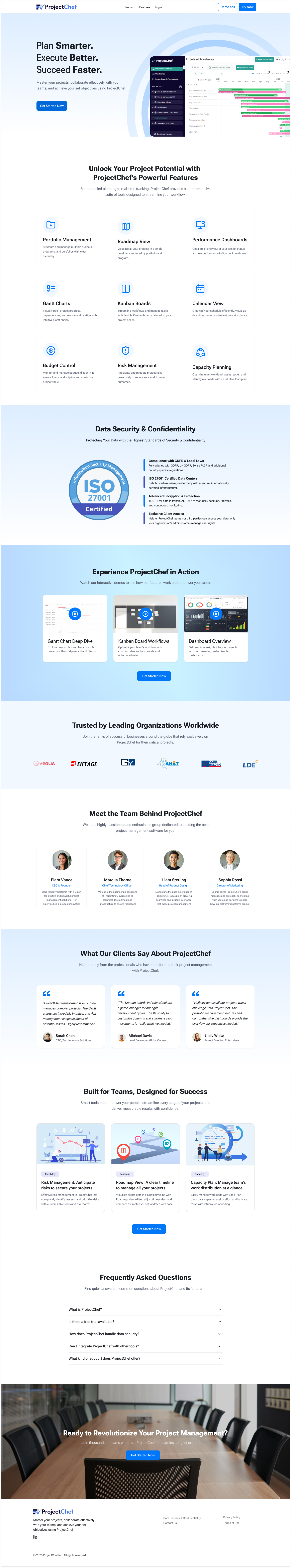
Landing Page Design
The landing page was crafted as a storytelling flow that builds trust and drives conversion.
Key Sections:
- Hero Section: Introduces the brand’s core value — “Plan Smarter. Execute Better. Succeed Faster.” with a strong CTA and product preview.
- Feature Highlights: Displays key capabilities like Portfolio Management, Gantt Charts, and Kanban Boards in a structured, scannable grid.
- Data Security Section: Reinforces user trust with the ISO 27001 certification badge and concise text on data protection.
- Product Demos: Showcases real dashboard previews and Kanban workflow videos for instant credibility.
- Team & Testimonials:Builds authenticity through real faces, professional bios, and positive client feedback.
- FAQ Section: Addresses user concerns with expandable answers for convenience and transparency.
- Closing CTA Banner: Finishes the journey with a bold statement — “Ready to Revolutionize Your Project Management?” prompting immediate action.
Design Principles Applied
- Consistency: Unified color palette, component system, and layout grid across all sections.
- Visual Hierarchy: Clear prioritization of primary actions and content.
- Aesthetic Usability Clean interface to enhance perceived simplicity.
- Cognitive Ease: Sequential storytelling structure reducing cognitive effort.
- Trust & Credibility: Certifications, client logos, and testimonials strengthening trust
Outcome
- Improved brand perception with a modern, enterprise-ready visual language.
- Increased user confidence through clear feature presentation and trust signals.
- Enhanced user engagement with interactive demos and relatable human elements.
- Established a scalable design system for future marketing pages and campaigns.